Using the new interactive charts
Our new charts are more interactive, more user-friendly and more informative, providing you with a market-leading charting tool.
This short guide is designed to help you make the most of the new charts. If you have any further questions please contact us.
Click on a hotspot  on the chart below to view a description of the section, or refer to the frequently asked questions beneath the chart.


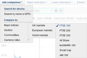
Add comparison
The 'Add comparison' menu allows you to add up to 10 different benchmark comparisons to the chart, including:
- Stocks (for example equities, bonds, ETFs)
- Major indices
- Sectors
- Commodities (Gold, Silver, Oil Brent, Oil WTI, Palladium or Platinum)
- Currency pairs
Search by name or EPIC
To search for a stock, for example Barclays Plc, click on 'Search by name or EPIC'; a window will appear. You can search by either entering the name of the stock, in this case 'Barclays' or the EPIC/ticker, in this case 'BARC'.
Press ENTER or click on the 'Search' button and the results will be returned, divided into four groups:
- Shares
- Indices
- Bonds
- ETFs
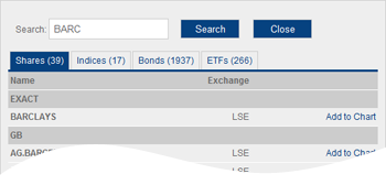
To add the stock you searched for to the chart, click the link: 'Add to Chart'. If the stock is not displayed you may need to refine your search term to be more precise and search again.
Once you are finished click 'Close' to return to the chart.
Add predefined indices, sectors, commodities or currency pairs
In the 'Add comparison' menu there are four sets of predefined benchmarks which can be added quickly and easily.
Simply find the item you want in the menu and click to add it to the chart.
For example, to add the FTSE 100, move your mouse cursor over the following:
Major indices » UK markets » FTSE 100
Upper indicators
The 'Upper indicators' menu allows you to select from a number of technical indicators which will appear overlaid on the main chart. These include:
- Simple moving averages (SMA) What is this?
- Exponential moving averages (EMA) What is this?
- Weighted moving averages (WMA) What is this?
- Bollinger Bands What is this?
- Envelopes What is this?
Adding an upper indicator
To add an upper indicator to the chart simply click on its name in the menu. It will immediately appear overlaid on the main chart.
You can add a maximum of three upper indicators at the same time.
For ease, switching to a 'Line' chart in the 'Chart style' menu is recommended. The default chart style is 'Mountain' which can affect the visibility of the indicators.
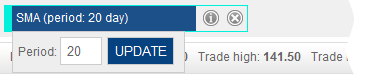
Customising the settings of the indicators
If you wish to change the settings of an upper indicator you can do so easily.
Firstly, add the indicator to the chart with the default settings.
Secondly, move your mouse cursor over the indicator in the legend bar above the main chart. A window will appear allowing you to amend the default settings to those of your choice.
Seeing the definition of an indicator
Each technical indicator comes with a brief definition. To see it, after adding an indicator, move your mouse cursor over the information icon  in the legend bar above the main chart.
To close it again simply move your mouse away.
Removing an indicator
To remove an indicator simply click on the close icon  in the legend bar above the main chart.
Lower indicators
For more advanced analysis, the 'Lower indicators' menu allows you to select from a list of technical indicators which will appear beneath the main chart.
Available indicators include:
- Volume (with or without a moving average)
- Average directional index What is this?
- Commodity channel index What is this?
- MACD (moving average convergence/divergence) What is this?
- Fast stochastics What is this?
- Slow stochastics What is this?
- Momentum What is this?
- Money flow index What is this?
- On balance volume What is this?
- Positive volume index What is this?
- Negative volume index What is this?
- Rate of change What is this?
- Relative strength index cutler What is this?
- Vertical horizontal filter What is this?
- Williams %R What is this?
Add a lower indicator
To add a lower indicator to the chart, simply click on its name in the menu. It will immediately appear beneath the main chart.
You can add a maximum of three lower indicators at the same time.
Customising the settings of the indicators
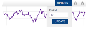
If you wish to change the settings of a lower indicator you can do so easily.
Firstly, add the indicator to the chart with the default settings.
Secondly, move your mouse cursor over the 'OPTIONS' link in the legend bar above the indicator. A window will appear allowing you to amend the default settings to those of your choice.
Seeing the definition of an indicator
Each technical indicator comes with a brief definition. To see it, after adding an indicator, move your mouse cursor over the information icon in the legend bar above the indicator.
To close it again, simply move your mouse away.
Removing an indicator
To remove an indicator, simply click on the close icon in the bar above the indicator.

Events
The 'Events' menu allows you to overlay several different event types onto the main chart. These include:
- Director deals for the past two years
- An indication of a company's fiscal quarters
To add an event simply click on its name within the menu. After a few seconds the event should appear on the main chart.
Chart style
Within the 'Chart style' menu you can select exactly how you want the chart to appear, including the cursor, the axis or the chart itself.
Chart type
This section controls how the line for the main stock on the chart will appear. Note that all benchmarks will appear as a single line, the style of which cannot be altered.
Mountain
This is the default style. It displays the chart as a line but shades the area beneath the line.
Line
'Line' is the same as 'Mountain' but without the shading beneath the line. This view is particularly useful when adding upper indicators.
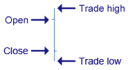
Open-High-Low-Close (OHLC)
Each symbol on an 'Open-High-Low-Close' chart shows the price range over the period and the opening and closing prices.
For example, when viewing a single day, the vertical line represents the range of prices throughout the trading day. The horizontal line to the left of the vertical line represents the opening price and the horizontal line to the right represents the closing price.
High-Low (HL)
A 'High-Low' chart style shows the price range over the period in the same way as an OHLC chart. However, it does not show the opening and closing prices.
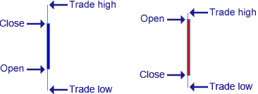
Candlestick (blue/red)
A 'Candlestick (blue/red)' chart is similar to an OHLC chart in that it displays the price range, open and closing price of a stock over a given period.
The bar represents the opening and closing price, with a blue bar showing a positive movement, where the closing price exceeds the opening price (and is therefore denoted by the top of the bar), and with a red bar showing a negative movement where the opening price exceeds to closing price.
Similar to an OHLC chart, the vertical line extending beyond the thicker bar represents the highest and lowest price of the stock during that period.
Candlestick
The 'Candlestick' chart is identical to the 'Candlestick (blue/red)' chart above, but does not colour the bars. In this case, a blue bar represents a negative movement; a white bar represents a positive movement.
Data display
This section controls the vertical chart access and dictates whether you wish to chart the price or the percentage performance.
Price
'Price' is the default setting and will show the unit cost of the main stock.
Percentage
Selecting 'Percentage' will display the stock's percentage performance with the first point on the chart representing the starting point, or the 0% base line.
The chart will be coloured blue or red depending on whether it's a positive performance or a negative performance.
Adding comparison benchmarks
When you add a comparison to the chart, for example an index or another stock, this option automatically switches to 'Percentage'.
Consider two stocks displayed on the chart: Stock A is priced at 10 pence and fluctuates between 9 and 11 pence in a day. Stock B is priced at 1500 pence and fluctuates between 1350 and 1650 pence in a day. To plot Stock A and Stock B on the same chart would be very difficult with the default settings, as the 2 pence range of Stock A is very insignificant when compared to the 300 pence range of Stock B. However, both ranges are 20% of the stocks' prices, so both stocks have actually performed equally, relatively speaking.
If you wish to view the prices for each stock rather than the percentage, you can switch this option back to 'Price'. This will display a separate vertical axis to the right of the chart – one for each comparison stock/benchmark. The line on the chart should then be matched to its corresponding axis by colour.
Data scale
This section allows you to choose between 'Linear' and 'Logarithmic' scales for the vertical axis.
The default option is 'Linear' which attributes equal spacing to the vertical axis, so a movement of 10p is represented by the same vertical distance regardless of the price of the stock. This means a movement from 10p to 20p appears equal in vertical distance to a movement of 70p to 80p even though the percentage changes are quite different (100% and 14.28% respectively).
A logarithmic scale measures price movements in percentage terms. For example, a movement of 10p to 20p represents an increase of 100%. On a logarithmic scale, this would be given the same vertical space, and appear the same as a movement of 70p to 140p - also a movement of 100%.
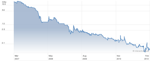
The logarithmic scale can therefore be useful for stocks which demonstrate a significant range in price. Take the following as an example.
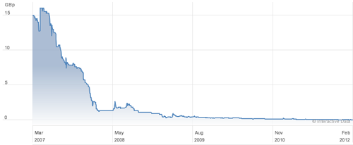
This stock fell from around 15p in 2007 to 1.4p in 2008 to 0.05p today. As a result of the large range of prices, significant recent percentage movements have lost clarity and the line appears almost flat.
The same stock displayed with a logarithmic scale changes to:
For stocks that show prices within a relatively tight range, or over a short period of time, the linear chart is more common. In these scenarios, switching to the logarithmic chart will sometimes appear no different to the linear equivalent.
Crosshair type
When you move your mouse across the chart a crosshair shows your position and a box alongside shows the price at that point.
You can change the crosshair to be:
- A cross
- A vertical line
- Off
Note, it is not possible to remove the price box that follows your mouse cursor.
Performance bar
The 'Performance bar' appears at the foot of the main chart and shows whether the stock has increased (blue), decreased (red) or not changed (green) in value between each label on the horizontal axis.

Tools
The 'Tools' menu allows you to perform some useful functions, as follows.
Save default settings
If you always like to view a chart in a particular way - for example you may choose some moving averages, volume and to have the FTSE 100 benchmark added - rather than setting it up every time you view a chart you can save this as your default settings by clicking this link.
Now every chart you view will start with these settings.
Revert to default
Click this link to change any customised chart back to the settings you saved above.
Clear defaults
This will remove the saved defaults and revert the chart to a basic view.
Print this chart
Clicking this link will create a printer-friendly version of the chart which you can print should you wish to retain a copy.
While every effort has been made to ensure the charts print as well as possible, print quality may be dependent upon settings unique to the printer. For example, it may be necessary to select to fit the chart to the paper size when printing. This can usually be done in the printer dialogue box that appears after you select to print from the chart.
Data interval
The 'Data interval' is the time between each point plotted on the chart. For example, when viewing a 1-year chart, you have the option to select 'Daily', 'Weekly' or 'Monthly'. If you select 'Daily' the chart will plot a point for each trading day over the year; if you select 'Weekly' it will plot a point for each week and so on.
Intraday prices (ie prices from during the trading day) are only available for the most recent ten days. During this period, the data interval options available are '1 minute', '15 minutes', '30 minutes' and 'Hourly'.
For periods earlier than the most recent ten days, the shortest interval available is 'Daily'.

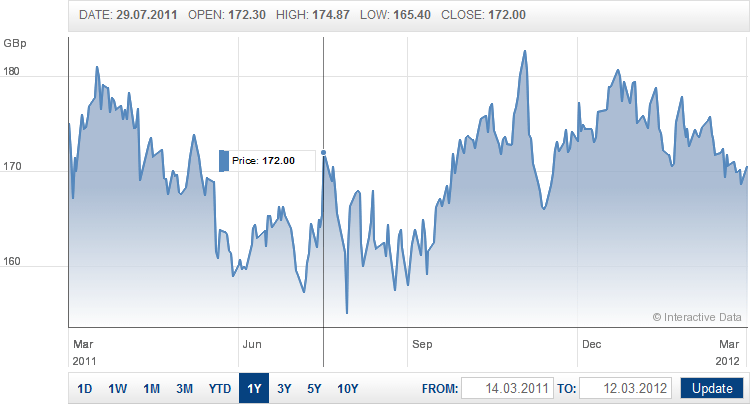
Main chart canvas
This area is where the main chart will appear. It will display the stock you are viewing over the time period you have chosen (the default time period is one year), plus any benchmark comparisons or upper indicators you have added.
Any lower indicators you add will appear immediately beneath the main chart.
Overlay
As you move your mouse across the chart a crosshair will appear along with a box which displays the price at that exact point in time, as indicated by the crosshair's position along the horizontal axis.
Further information for the point relating to the crosshair's position can be seen immediately above the chart, such as the date for that point, the periods's trade high, trade low, open and close.
If you have added any benchmark comparisons to the chart, a colour-coded box will also appear to show their respective values at that point.
Selecting a predefined time period
There are nine predefined time periods available by clicking one of the links beneath the chart.

These are:
- 1D = One day
- 1W = One week
- 1M = One month
- 3M = Three months
- YTD = Year to date (ie January 1st of the current year to today)
- 1Y = One year
- 3Y = Three years
- 5Y = Five years
- 10Y = Ten years
Entering a custom time period
You can enter a custom time period to the right of the predefined time period buttons. Here you can enter a specific 'FROM' and 'TO' date. After you click on either box, a calendar will appear allowing you to pick a date quickly and easily. Click 'Update' to confirm your chosen dates.

Zooming
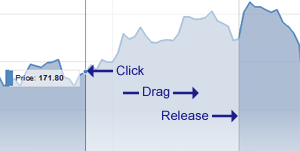
If you wish to zoom into an area on the main chart you can do so by dragging a window over the area of interest. Simply click and hold on one side, move your mouse to the other side and release the button. The chart will automatically focus into that area.
If you want to zoom back out, simply change the time period using one of the other controls described here.
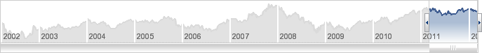
Full chart slider
The full chart slider shows an image of your selected stock over the past ten years.
By dragging the left and right arrows of the highlighted window across this area, you can zoom in on the specific time period that interests you.
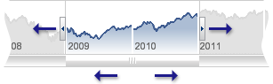
In addition, you can move the window along by dragging the scrollbar immediately beneath it to the left or right, allowing you to view the same length of time at different points over the past ten years.

Frequently asked questions
Using the charts
- How do I add a stock?
- Why can't I find the stock I am looking for?
- How do I add an index, commodity or currency pair?
- How many instruments can I compare?
- How do I add technical indicators?
- How many technical indicators can I add?
- How do I change the time period?
- How do I print?
- Can I save a chart?
- What is the data interval?
- What is the performance bar?
- Why does the scale change to percentage when I add a comparison?
- What is a logarithmic scale?
General information
Upper indicators
- What is a simple moving average?
- What is an exponential moving average?
- What is a weighted moving average?
- What are Bollinger Bands?
- What are envelopes?
- How do I customise an upper indicator?
Lower indicators
- What is Average Directional Index?
- What is Commodity Channel Index?
- What is MACD?
- What is Fast Stochastics?
- What is Slow Stochastics?
- What is Momentum?
- What is Money Flow Index?
- What is On Balance Volume?
- What is Positive Volume Index?
- What is Negative Volume Index?
- What is Rate Of Change?
- What is Relative Strength Index Cutler?
- What is Vertical Horizontal Filter?
- What is Williams %R?
- How do I customise a lower indicator?
How do I add a stock?
To add a stock simply move your mouse cursor to the menu option 'Add comparison' above the chart and select 'Search by name or EPIC'.
A popup will appear into which you can enter the name of the stock or its EPIC/ticker.
Why can't I find the stock I am looking for?
The share charts include a comprehensive list of UK, European and North American stocks from the exchanges covered by the Hargreaves Lansdown share dealing service.
It may be possible that too many results are returned for the search term you enter, in which case please try to be more specific or, if applicable, use the EPIC/ticker.
How do I add an index, commodity or currency pair?
To add major indexes, commodities or currency pairs move your mouse cursor to the menu option 'Add comparison' above the chart and choose from the list.
You can also search for a specific index by name - see 'How do I add a stock?'
How many instruments can I compare?
It is possible to add ten benchmark instruments to the chart at any one time.
How do I add technical indicators?
To add an upper (within the main chart) or lower (beneath the main chart) indicator, simply move your mouse cursor to the menu option 'Upper indicators' or 'Lower indicators' and select an indicator from the list.
How many technical indicators can I add?
It is possible to add up to three upper and three lower indicators concurrently.
How do I change the time period?
There are several ways to change the time period:
- The easiest and quickest way is to use the predefined time periods towards the bottom left of the chart, eg '1D', '1W', '1M' etc
- You can specify dates using the 'FROM' and 'TO' input fields towards the bottom right of the chart
- Beneath the main chart is a smaller chart showing the full available history for the stock. Click and drag the left and right edges of the coloured window to select a time period, or move the window along to view the same duration at different points
- You can zoom in on an area of the main chart by clicking and dragging to draw a window over the period you wish to focus on.
How do I print?
To print the chart move your mouse cursor to the menu option 'Tools' and select 'Print'.
The charts are optimised to be printer-friendly but it may be necessary to set your printer options to scale the chart to your printer's paper size. This can usually be done in the popup that appears after you select 'Print'.
Can I save a chart?
Currently you cannot save an individual chart. However you are able to save the settings you have applied to a chart. This will then apply those settings to all charts you view. To do so, move your mouse cursor to the menu option 'Tools' and select 'Save default settings'.
What is the data interval?
The data interval is the amount of time between each point plotted on a chart. For example, a one-year chart has the options 'Daily': One point for every trading day; 'Weekly': A single point for the start of each week; or 'Monthly': A single point for the first trading day of every month.
Intra-day data is only available for the most recent ten trading days.
What is the performance bar?
The performance bar indicates whether a stock finished higher or lower over a number of periods within the chart's timeframe.
For example, on a one-year chart, the performance bar shows positive or negative movement over each quarter, with red denoting a negative overall price movement, and blue denoting positive.
You can show or hide the performance bar by moving your mouse cursor over the menu option 'Chart style' and selecting/deselecting 'Display performance bar'.
Why does the scale change to percentage when I add a comparison?
When you compare two instruments on the same chart the vertical axis (Y axis) scale changes from price to percentage. This is the best view to compare like-for-like as it is not affected by the unit prices of the individual stocks. This is important because a 10% movement in a stock with a unit price of £20 is £2, whereas an equal 10% movement in a stock with a unit price of 10p is 1p; both percentage movements are the same even though the movement in value is vastly different.
You can choose to force the chart to display price rather than percentage by moving your mouse cursor over the menu option 'Chart style' and selecting 'Price'. This will add a separate vertical price axis for each of the benchmark stocks and reduce the effective width of the main chart area.
What is a logarithmic scale?
The default scale on the vertical axis (Y axis) is linear. A linear scale shows 10 points as the same vertical distance no matter what the price level. If a stock increased from 10p to 20p this would appear identical on a linear chart to if it moved from 70p to 80p, even though the percentage increases are quite different (100% and 14.29% respectively).
A logarithmic scale measures price movement in percentage terms, so the vertical space between points relates to the percentage change. In this case, a movement of 10p to 20p represents a 100% increase. A movement of 70p to 140p would therefore show the same vertical distance as it also represents a 100% increase.
A linear scale is preferable when the prices on the chart are confined within a relatively tight range or for short term charts. Logarithmic charts are useful for long term charts or those that show large movements as it can put those movements into perspective.
Why are the charts changing?
What if I have a question about the charts?
If you experience any technical difficulties or have any questions about the new charts, please contact us.
What is a simple moving average?
A simple, or arithmetic, moving average is the average closing price of a share over the last “x” days. For example, the SMA (20 day) will chart the average closing price of a share for the previous 20 days. Shorter-term averages respond quickly to changes in the share price, while longer-term averages can be slow to react.
What is an exponential moving average?
Similar to a weighted moving average, except the emphasis of the closing price decreases exponentially from each previous price. The exponential moving average is also known as 'exponentially weighted moving average'.
What is a weighted moving average?
Similar to a simple moving average, except there is greater emphasis on the most recent prices. This average is calculated by taking each of the closing prices over a given time period and multiplying them by its position in the data series. Once the position of the time periods have been accounted for average price is calculated.
What are Bollinger Bands?
Bollinger bands consist of a centre line and two price channels (bands) above and below it. The centre line is an exponential moving average; the price channels are the standard deviations of the share being studied. The bands will expand and contract as markets become more or less volatile.
What are envelopes?
Envelopes determine the lower and the upper margins of the price range. There are two moving averages: one of which moves upward and another one moves downward. Both are the basis of the Envelopes.
How do I customise an upper indicator?
To customise an upper indicator first add it to the chart.
Once it has been added you will see a box containing the colour-coded indicator with it's default settings above the main chart. Move your mouse cursor over this area and a popup will appear allowing you to edit the relavant details.
What is Average Directional Index (ADX)?
The Average Directional Movement Index helps measure a trend's intensity, without indicating the trend's direction. The ADX is often used in conjunction with other indicators.
What is Commodity Channel Index?
Frequently used to identify overbought or oversold shares in a cyclical, sideways-moving market. The Commodity Channel Index CCI measures the current share price relative to is average price over a given period of time.
What is MACD?
The Moving Average Convergence/Divergence (MACD) gauges the difference between fast exponential moving average EMA and the slow EMA, with the fast EMA continually converging and diverging.
What is Fast Stochastics?
Stochastics position a share's closing price in relation to its recent high/ low trading range. They are useful to gauge sideways-moving markets. Fast Stochastics are more sensitive to sudden changes in the underlying share price than slow stochastics.
What is Slow Stochastics?
Stochastics position a share's closing price in relation to its recent high/ low trading range. They are useful to gauge sideways-moving markets. Slow stochastics are less sensitive to sudden changes in the underlying share price than fast stochastics.
What is Momentum?
Momentum is an oscillator, which measures the speed of price movements by relating the rate of price change to the price itself.
What is Money Flow Index (MFI)?
The MFI indicates buying and selling pressure within a price movement. Its interpretation is similar to the RSI.
What is On Balance Volume (OBV)?
OBV relates price movement to volume, adding the traded volume to the indicator on up days and subtracting it on down days.
What is Positive Volume Index (PVI)?
The PVI measures traded volume to determine trend strength or to confirm a price movement (like Negative Volume Index).
What is Negative Volume Index (NVI)?
The NVI measures traded volume to determine trend strength or to confirm a price movement (like Positive Volume Index).
What is Rate Of Change?
The Rate Of Change oscillator indicates price change in percent over a given period (similar to Momentum).
What is Relative Strength Index Cutler?
The Relative Strength Index (RSI) compares the average of prices on up days with that of down days. The RSI may be used to detect the weakening of trends.
What is Vertical Horizontal Filter?
The Vertical Horizontal Filter distinguishes a trend in price movement from a sideways-moving market.
What is Williams %R?
The Williams %R, like Stochastics, position a share's closing price in relation to its recent high/ low trading range.
How do I customise a lower indicator?
To customise a lower indicator first add it to the chart.
Once it has been added you will see 'OPTIONS' in the top right corner of each indictor. Move your mouse cursor over 'OPTIONS' and a popup will appear allowing you to edit the relevant details.